Interior design serves as a spirit bond connecting the people and the building environment. It is a communication to convey the messages of the culture, nature and people’s value in current sociality. Interior design is concerned with more than just the aesthetic experience of a user within a building. The user experience in interior space relates to human interaction within the space, its contents, and the interaction between people who share this experience. All these factors create social meaning.
Fairy tales have been transmitted from one generation to another. However, recently people realized that it is a dangerous to extol the superiority, dominance and conquer and perpetuate the values which marginalize women and minority ethical groups. How can interior design and American animation, hand in hand, convey the positive values and lack of negative judgment portrayed in animation in order to make them rethink their own values?
The resulting museum design will convey the positive values, while lacking the negative judgment commonly portrayed in animation, and thus require people to rethink their own values.
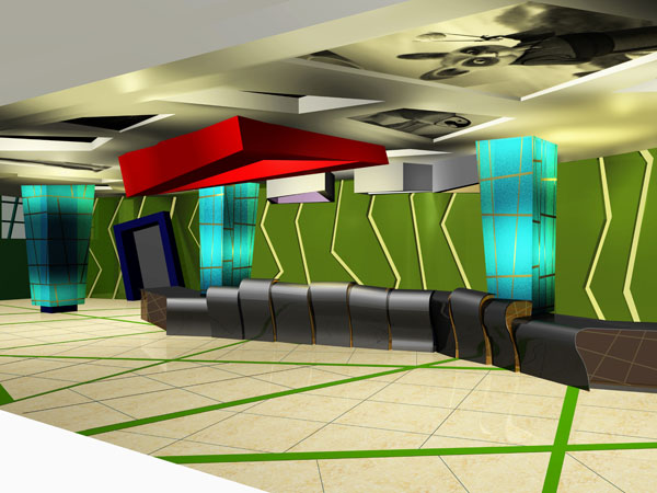
The Reception Area
The slopped ceiling and irregular shaped floor and wall pattern create a sense of disorder to prepare people to enter an uncertain and unpredictable experience. The ceiling made form Skyline glass with the animation figures etched.
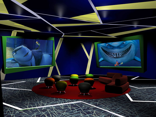
The Cinema Room
This disorganized space is figured by a rotating floor. Then you cannot tell where is front and where is back. After you enjoy the move in Finding Nemo, the brutal shark will become a gentle vegetarian in Shark Tale.
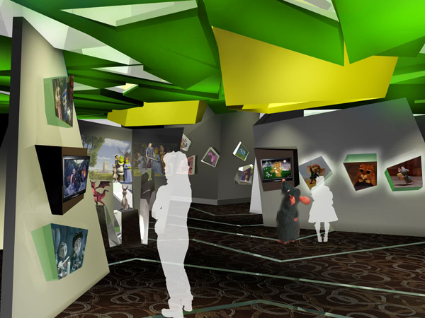
The Mouse Gallery
This is a space to play the fun of binary oppositions. Our value are changing that a lot of creatures lost their characteristics. The mouse is an example who lost its identity in current society for it is appreciating how Jerry bully Tom. On the left side of the gallery, the exhibition shows how women changes their society and family roles, shift from waiting for men to rescue to fight with the men hand by hand.
The mirrors in the ceiling fragmented reflect people’s activity in the interior. The exhibition walls and boxes try to break the hierarchy. This is a space with disorder and fragmentation.
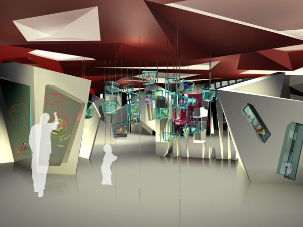
The Innovation Center
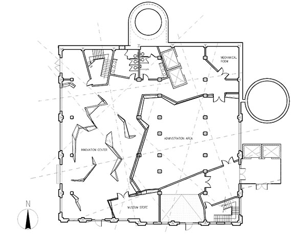
Coming here to create your own animation and place your own order for the story. There are many boxes hanging from the ceiling. You can pull it down and place them in the wall or any where you want to create your own order.
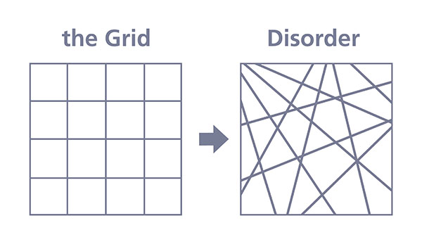
The gird, an organizing system for architecture, interior design, graphic design etc, has been broken by several disorganized lines. Those lines become the parti. The zigzagged walls convey a blurred message to make people lost their direction.
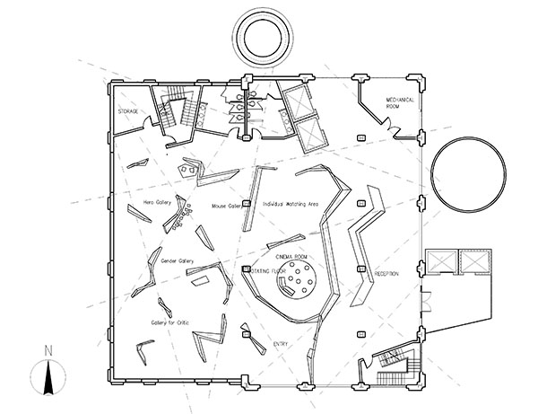
Second Floor, main entrance level
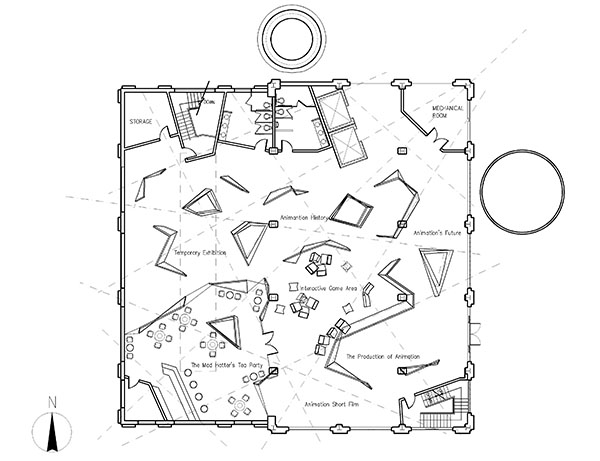
Third Floor
First Floor, exit
The Materials / Furniture / Lighting

According to the statistic of the National Kidney Foundation, there are more than 275,000 dialysis patients in the U.S. and more than 67,000 people die each year because of kidney failure. The Cleveland dialysis clinic located in Cleveland, Ohio aims to integrate harmoniously with nature to enhance human performance and increase human health.
The design of the Ohio Clinic is based on the theory of symbiosis. In order to achieve symbiosis between the human and nature, the design keeps contact with the surrounding area.
Sustainable design offers a health and high performance environment for the patients. The building uses prefab system, WeeHouse, which is produced by Alchemy Architects. The system not only reduces the building cost, but also featured by sustainable finish and material, such as bamboo floors. The building facade is open to natural light and ventilation cutting down the energy consumption. The interior partition wall is translucent to allow the natural light in and offer an unblocked view to the whole space. Energy efficient fluorescent and metal halide fixtures serve to supplement the daylight. Lighting sensors used in office areas and nurse stations allow proper dimming of the artificial lighting. Most of the materials are recycled materials or can be recycled such as recycled textures:3 form recycled countertops and veneer. The paints used are Pure Performance paints from PPG which contain VOCs to protect the indoor air quality. In the restroom, water from the sink is sent to grey water storage area for use in the toilets. Occupancy control sensors prevent wasting energy in storage and bathroom areas. Sensors on faucets prevent wasting of water.

The Building
The building uses prefab system, WeeHouse, which is produced by Alchemy Architects. The system not only reduces the building cost, but also featured by sustainable finish and material, such as bamboo floors. In order to protect the original site, the building has different height which dramatically reduces the amount of earthwork and preserves the natural landform. All rooms in the building can access to the natural light and have fantastic view to the surrounding area.

The Plan
The building consists of three volumes which are connected by bridges and create three zones and landscape spaces: court yard space, waiting area and exterior café area. Those volumes divide the clinic into three different areas for patients. Patients in each area can access different views of the nature and people’s activities both inside and outside which exert positive feelings and reducing stressful thoughts. The waiting area in the glass atrium is a space connecting two volumes which blurs the boundary of the interior and exterior.

The Waiting Area
The waiting area in the glass atrium is a space connecting two volumes which blurs the boundary of the interior and exterior. When the sunlight hits the aluminum frame in the ceiling and wall, a dramatic shadow is shaped in the interior.

The Exterior Cafe Area
It is an extension of the interior which provides the outdoor activities for the occupants and achieves symbiosis with the nature.

The Nurse Station

Longitudinal Section

Transverse Section

First Floor

Second Floor

First Floor

Second Floor

The Materials / Furniture / Lighting


Atrium: Lotus Bar

View from the second floor

Design Sketch
Floor Plan

Section
Second Floor Restaurant

Lotus Bar Sketch: inspired from the surrounding area and eastern culture

The Building

The Materials / Furniture / Lighting
|

